Typography Lesson
Helvetica is a feature-length documentary about typography, graphic design and global visual culture. It looks at the proliferation of one typeface as part of a larger conversation about the way type affects our lives.


Butterick’s Practical Typography is a wonderful resource. If you are in a hurry it gives you what you need to know about type in ten minutes, but it also serves as an interactive text book covering the basics and specifics in clickable bits.
Good typography is measured by how well it reinforces the meaning of the text, not by some abstract scale of merit.
Here is a sampling of what you will find.
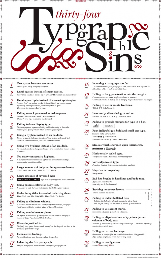
SUMMARY OF KEY RULES
- The four most important typographic choices you make in any document are point size, line spacing, line length, and font, because those choices determine how the body text looks.
- point size should be 10–12 points in printed documents, 15-25 pixels on the web.
- line spacing should be 120–145% of the point size.
- The average line length should be 45–90 characters (including spaces).
- The easiest and most visible improvement you can make to your typography is to use a professional font, like those found in font recommendations.
- Avoid goofy fonts, monospaced fonts, and system fonts, especially times new roman and Arial.
- Use curly quotation marks, not straight ones (see straight and curly quotes).
- Put only one space between sentences.
- Don’t use multiple word spaces or other white-space characters in a row.
- Never use underlining, unless it’s a hyperlink.
- Use centered text sparingly.
- Use bold or italic as little as possible.
- all caps are fine for less than one line of text.
- If you don’t have real small caps, don’t use them at all.
- Use 5–12% extra letterspacing with all caps and small caps.
- kerning should always be turned on.
- Use first-line indents that are one to four times the point size of the text, or use 4–10 points of space between paragraphs. But don’t use both.
- If you use justified text, also turn on hyphenation.
- Don’t confuse hyphens and dashes, and don’t use multiple hyphens as a dash.
- Use ampersands sparingly, unless included in a proper name.
- In a document longer than three pages, one exclamation point is plenty (see question marks and exclamation points).
- Use proper trademark and copyright symbols—not alphabetic approximations.
- Put a nonbreaking space after paragraph and section marks.
- Make ellipses using the proper character, not periods and spaces.
- Make sure apostrophes point downward.
- Make sure foot and inch marks are straight, not curly.


Behind the Typeface: Cooper Black from Cheshire Isaacs on Vimeo.
A short introduction to early 20th Century Modernist design and the art movements they evolved from including De Stijl, Dada, Constructivism and Futurism with work by Jan Tschichold, Walter Dexel, Piet Zwart, Kurt Schwitters and more. Talk recorded in Joshua’s Typography Studio class at MCAD, Spring 2015.
Letterforms as Identity: A Brief History of Typography at The New York Times with Kelly Doe from Type@Cooper on Vimeo.
This talk took place in The Rose Auditorium at The Cooper Union on April 11, 2017 as part of the Herb Lubalin Lecture Series
From hand-set beginnings in 1851 to current print and digital variations, typography has always been a defining characteristic of The New York Times identity.
Throughout its history, The Times has been an innovative and early adopter—there has always been a need to deliver the news as effectively as the technology of the moment allows. Yet its identity also evolved via the work of editors, art directors, type designers, and artists. Their intersecting relationships had considerable impact on the design of the news, the magazines, and the marketing.
This expansive look at New York Times typographic history will include such topics as: Black letter, logotypes and Q-heads; walking on the moon, the Pentagon Papers and 9/11; new typeface and digital development — and the creative impact of Lou Silverstein, Matthew Carter and many others.
Kelly Doe is the Design Director for Brand Identity at The New York Times, where she is currently focusing on video, new digital products and the creation of company-wide brand guidelines.
Web Typography is just typography, sort of with Amy Papaelias from Type@Cooper on Vimeo.
Typographics 2017: Type is a Canvas with Natasha Jen from Type@Cooper on Vimeo.
Typographics: Entertaining Typography with Emily Oberman from Type@Cooper on Vimeo.
Typographics 2015: The Good Old Bad Old Days with Louise Fili, Steven Heller, Seymour Chwast, and Paula Scher from Type@Cooper on Vimeo.
Dear Data. Giorgia Lupi and Stefanie Posavec

Dear Data is a year-long, analog data drawing project by Giorgia Lupi and Stefanie Posavec, two award-winning information designers living on different sides of the Atlantic. By collecting and hand drawing their personal data and sending it to each other in the form of postcards, they became friends.
ONLINE RESOURCES
- Alphabettes
- Fonts in Use
- I Love Typography
- Nice Web Type
- State of Web Type
- Type Detail
- Typekit Practice
- Type Terms
- Type Thursday
- Typewolf
- Typographica
- Typography Handbook
- Typography on the Web
- Web Field Manual
Variable Fonts
30 JAN 2017
Variable fonts are coming. How will it change the web design and development process? Tim Brown and Bram Stein explain how variable fonts will work and what you can do with them now.
Legibility
NASA’s List of Design Recommendations
- Sans-serif fonts are usually more legible than fonts with serifs.
- Avoid using a font that has characters that are too similar to one another, as this will reduce the legibility of the print.
- Avoid using dot matrix print for critical flight-deck documentation.
- Long chunks of text should be set in lower case.
- If upper case is required, the first letter of the word should be made larger in order to enhance the legibility of the word.
- When specifying font height, or accessing graphs to determine the size of a lower-case character, the distinction between “x” height and overall size should be made.
- As a general recommendation, the “x” height of a font used for important flight-deck documentation should not be below 0.10 inch.
- The recommended height-to-width ratio of a font that is viewed in front of the observer is 5:3.
- The vertical spacing between lines should not be smaller than 25–33% of the overall size of the font.
- The horizontal spacing between characters should be 25% of the overall size and not less than one stroke width.
- Avoid using long strings of text set in italics.
- Use primarily one or two typefaces for emphasis.
- Use black characters over a white background for most cockpit documentation.
- Avoid using white characters over a black background in normal line operations. However, if this is desired:
- Use minimum amount of text.
- Use relatively large typesize.
- Use sans-serif to minimize the loss of legibility.
- Black over white or yellow are recommended for cockpit documentation.
- Avoid using black over dark red, green, and blue.
- Use anti-glare plastic to laminate documents.
- Ensure that the quality of the print and the paper is well above normal standards. Poor quality of the print will effect legibility and readability.
- The designer must assess the age groups of the pilots that will be using the documentation, and take a very conservative approach in assessing information obtained from graphs and data books.
There are, of course, countless examples of bad typography. Luckily, only a few of them ever come close to contributing to accidents or confusion in times of emergency. But in those cases, even tiny tweaks to a letterform or subtle differences in typeface style become a really big deal. So keep that in mind the next time you hit caps lock.

Know of any more life-saving font examples? Email me at lena.groeger@propublica.org.


0 Comments