Massimo Vignelli
Michael Beirut talks about the creative influence from his first job with Massimo and Lela Vignelli.
In Studio With: Massimo Vignelli from Design Indaba on Vimeo.
The elegant and enthusiastic man that taught us the rules of modernism as applied to graphic design will be greatly missed but his canon will remain.
Since his 2014 obituary titled “A Visionary Designer Who Untangled the Subway” was published in the New York Times many tributes have been shared to honor the legacy of Massimo Vignelli. Fast Co. Design gives a nice overview including a report of the outpouring of love that the design community shared. Another outlines personal experiences and lessons by Michael Bierut on Design Observer. For me, his influence came from his enjoyment of life/work with his wife and his commitment to clean design. I wouldn’t consider myself a modernist by any measure, but we can all appreciate Massimo’s focus on clarity of message and admire his elegant taste and good natured type snobbery.

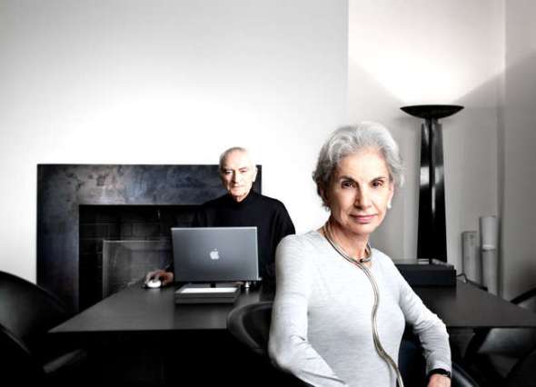
Photo © John Madere
Massimo Vignelli one of the foremost designers in the Modernist tradition focuses on simplicity through the use of basic geometric forms. He has been happily collaborating with his designer wife Lella since they were married and left Italy to take over America by design.
They made a promise to each other that “if you can’t find it—design it.”
The Vignelli’s were inspired by one of the greatest architects of the 20th century—Ludwig Mies van der Rohe (1886-1969). By emphasizing open space and revealing the industrial materials used in construction Mies helped define modern architecture and has been credited with the maxims “less is more” and “God is in the details.”
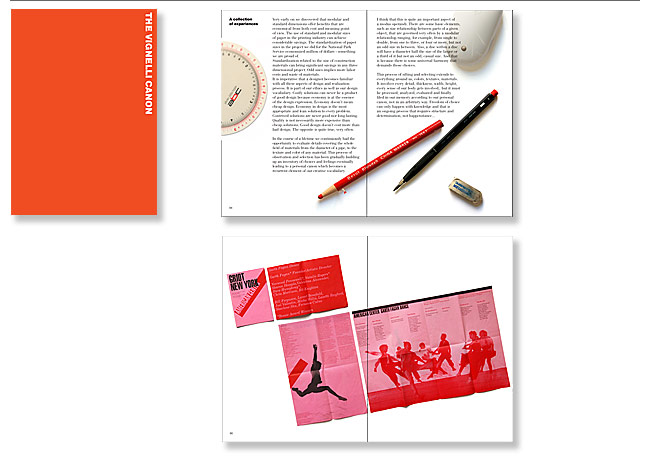
The Vignelli Canon is a free ebook that outlines and expands on the simple rules of modernism followed by Massimo and his disciples.
The Vignelli’s established a cultural platform emphasized by their struggle with decoration versus function and always employed the subtractive method of working—taking things out until all that is left is the essence.
The canon includes a list of the only six typefaces necessary if you want to be a full-fledge Modernist Type Snob:
- Garamond – 1532
- Bodoni – 1788
- Century Expanded – 1900
- Futura – 1930
- Times Roman – 1931
- Helvetica – 1957
The Timelessness section of The Vignelli Canon reads like a manifesto and summarizes the modern directive.
The following is quoted from the Vignelli Canon.
- We are definitively against any fashion of design and any design fashion. We despise the culture of obsolescence, the culture of waste, the cult of the ephemeral. We detest the demand of temporary solutions, the waste of energies and capital for the sake of novelty.
- We are for a Design that lasts, that responds to people’s needs and to people’s wants We are for a Design that is committed to society that demands long lasting values. A society the earns the benefit of commodities and desires respect and integrity.
- We like the use of primary shapes and primary colors because of their formal values are timeless.
- We like a typography that transcends subjectivity and searches for objective values, a typography that is beyond times – that doesn’t follow trends, that reflects its content in an appropriate manner.
- We like economy of design because it avoids wasteful exercises, it respects investment and lasts longer. We strive for a Design the is centered on the message rather than visual titillation. We like Design that is clear, simple and enduring. And that is what timelessness means in Design.
Responsibility
- One- to ourselves, the integrity of the project and all its components.
- Two – to the Client, to solve the problem in a way the is economically sound and efficient
- Three – to the public at large, the consumer, the user of the final design.
- On each one of these levels we should be ready to commit ourselves to reach the most appropriate solution, the one the solves the problem without compromises for the benefit of everyone. In that send, a design should stand by itself, without excuses, explanations, apologies. It should represent the fulfillment of a successful process in all its beauty. A responsible solution.

Type Sizes Relationship
- Stick to no more than two type sizes on a printed page, but there are exceptions. In a world where everybody screams, silence is noticeable. White space provides the silence. That is the essence of our typography.
- The relationship between the size of the type and the space around it is one of them oct delicate and precious elements of composition. I must say that the masterful handling of white space on a printed page is perhaps the most peculiar attribute of American graphic design….Almost all the great American graphic designers have used white space as the significant silence to better hear their message loud and clear.
- Such is indeed the power of the white space.
- Manipulation of scale implies knowledge and full awareness of the meaning of scale.

Colors
- Prefer a primary palette of Red, Blue, and Yellow. …
- Appropriateness is one of the rules we use in choosing colors knowing how effective it can be to use the right color at the right time.
Massimo’s influence has served a long line of well-known and successful designers that I admire. Including Michael Bierut, and upcoming design super couple Armin Vit and Bryony Gomez-Palicio, Debbie Millman, and my first boss Steve Phillips.
Massimo Vignelli discusses his approach to book design in a video produced for Mohawk’s “What Will You Make Today?” campaign. Video design by Michael Bierut/Pentagram.
If you have the time, please enjoy this entertaining lecture by Massimo. He confesses to some hilarious stories, including how they won the Ford account by wearing white lab coats and getting their friends to cut paper and pretend to be busy….. good stuff…. he was so cute and lovable….NOTHING LIKE Paul Rand — he was grouchy.
MASSIMO VIGNELLI | OFFSET 2009 from OFFSET on Vimeo.
Check our more meetinghouse {lessons}


0 Comments